Tag: statistics

COVID-19: The Statistics of Social Distancing

By James Kwak

It seems that social distancing is the primary strategy for slowing the propagation rate of COVID-19. That and widespread testing are the key tools for containing an outbreak, for reasons discussed repeatedly in the media.

cathedral-square-592752_1280
Photo by Hans Braxmeier from Pixabay

But does it work? Or, more to the point, how well do different degrees of social distancing work? How strict does it need to be, and how tightly does it need to be enforced? It seems to me that this is an important and at least theoretically answerable question.

Thanks to ubiquitous commercial and government surveillance, there are staggeringly comprehensive databases of exactly where people are at all times. Google has one, for example. Picture for yourself an enormous aerial picture of some metropolitan area with a dot for every person’s location; then picture those dots moving around as time passes. That’s more or less what is available. (Some people are blocking their location data, and some people don’t have personal surveillance devices smart phones. But there are certainly enough people transmitting their location to do the analysis discussed below.)

Continue reading “COVID-19: The Statistics of Social Distancing”

Economic Anxiety and the Limits of Data Journalism

By James Kwak

[Updated: see bottom of post.]

There is an ongoing battle among the liberal intelligentsia over “economic anxiety.” The basic question is whether economic factors—loss of manufacturing jobs, decline in living standards, increase in insecurity—are a valid explanation for the rise of Trump. To simplify, one side claims that economic anxiety is one reason, along with racism (and sexism, and anti-Semitism, and …), for Trump’s popularity; the other side claims that the economic argument is wrong, and the Trump phenomenon is all about racism (and sexism, and anti-Semitism, and …).

This debate has reached its cultural apogee with the genre of the economic anxiety tweet, which features a racist, sexist, anti-Semitic, or otherwise reprehensible Trump supporter, accompanied by a sarcastic comment about the supporter’s “economic anxiety.” Here are some recent examples (screenshots because WordPress doesn’t seem to display the second-level embedded tweet properly):

screen-shot-2016-10-16-at-8-42-07-pm

screen-shot-2016-10-16-at-8-42-37-pm

Why this particular debate has become so bitter has been lost to history. Probably the economic anxiety deniers think that explaining Trump in (partially) economic terms amounts to excusing or ignoring racism, while the economic anxiety believers think that the racism-only story ignores the erosion of the middle class over the past thirty years. This is why—since we’re all well-meaning liberals here—when not confined to 140 characters, the deniers take pains to say that we should help poor people, while the believers take equal pains to say that racism is bad.

The people thinking of the clever economic anxiety tweets are just doing it to annoy the other side; they know that one anecdote, or several dozen, doesn’t prove anything. But periodically there are attempts to disprove the economic anxiety hypothesis—with data! Dylan Matthews of Vox is the latest to take up the challenge, with a long, heavily documented, and very heated argument that the Trump phenomenon is about race, not economics. But it fails, for a simple reason: You just can’t prove what he wants to prove with the data we’ve got.

Continue reading “Economic Anxiety and the Limits of Data Journalism”

Rumsfeldian Journalism

By James Kwak

I still have Nate Silver in my Twitter feed, and I used to be a pretty avid basketball fan, so when I saw this I had to click through:

In the article, Benjamin Morris tries to analyze how “bad”* the Detroit Pistons of the late 1980s and early 1990s (Bill Laimbeer, Rick Mahorn, Dennis Rodman, etc.) were, with full 538 gusto: “That seems like just the kind of thing a data-driven operation might want to quantify.” But the attempt falls short in some telling ways.

Continue reading “Rumsfeldian Journalism”

Random Variation

By James Kwak

As I previously wrote on this blog, one of my professors at Yale, Ian Ayres, asked his class on empirical law and economics if we could think of any issue on which we had changed our mind because of an empirical study. For most people, it’s hard. We like to think that we form our views based on evidence, but in fact we view the evidence selectively to confirm our preexisting views.

I used to believe that no one could beat the market: in other words, that anyone who did beat the market was solely the beneficiary of random variation (a winner in Burton Malkiel’s coin-tossing tournament). I no longer believe this. I’ve seen too many studies that indicate that the distribution of risk-adjusted returns cannot be explained by dumb luck alone; most of the unexplained outcomes are at the negative end of the distribution, but there are also too many at the positive end. Besides, it makes sense: the idea that markets perfectly incorporate all available information sounds too much like magic to be true.

But that doesn’t mean that everyone who beats the market is actually good at what he does, even if that person gets a $100 million annual bonus. That person would be Andy Hall, the commodities trader who stirred up controversy when he apparently earned a $100 million bonus at Citigroup—in 2008, of all years. (That was a year with huge volatility in the commodities markets.)

Continue reading “Random Variation”

Are Reinhart and Rogoff Right Anyway?

By James Kwak

One more thought: In their response, Reinhart and Rogoff make much of the fact that Herndon et al. end up with apparently similar results, at least to the medians reported in the original paper:

Screen shot 2013-04-18 at 4.20.55 PM

So the relationship between debt and GDP growth seems to be somewhat downward-sloping. But look at this, from Herndon et al.:

Screen shot 2013-04-18 at 4.18.02 PM

Continue reading “Are Reinhart and Rogoff Right Anyway?”

A Few Thoughts on Nate Silver

By James Kwak

Many people have spilled far more words on this topic than I can read, but I wanted to point out a few things that seem clear to me:

  • As Daniel Engber pointed out, the fact that Obama won (and that Silver called all fifty states correctly) doesn’t prove that Silver is a genius any more than Obama’s losing would have proven that he was a fraud.
  • In fact, Silver appears to have gotten a couple of Senate races wrong, but that still doesn’t prove anything, since his model spits out probabilities, not certainties.
  • To my mind, the crux of the debate was between: (a) people who believe that it is meaningful to make probabilistic statements about the future based on existing data (both current polls and parameters estimated from historical data); and (b) people who believe that there is something ineffable about politics that escapes analysis and that therefore there is something fundamentally wrong, or misleading, or fraudulent about the statistical approach. Silver, through no fault of his own, because associated with (a). To my mind, (a) is right and (b) is wrong because of logic and math, so the idea that one election could have settled the question was crazy to begin with.
  • Within camp (a), there are certainly valid methodological debates, and it’s by no means clear that Silver is the state of the art. Whether, in the last days of an election, he is any better than simple averages is an open question. The value Silver adds or doesn’t add can’t be judged by the final forecast, because one point of his model is to incorporate factors that are not incorporated in current polls (e.g., economic conditions). (Another aspect of the model is to not overreact to short-term trends—but that aspect also largely vanishes by the night before.) So the superiority of the  model, if it is superior, would appear months before the election, not the night before. But that is even harder to verify by ultimate results. Ideally you would have many elections and for each one you would have a Silver forecast six months before and a simple poll average six months before and you would see which had a higher batting average. I would bet on Silver, but we’ll never have enough data to resolve that question.

If the outcome makes people take statistics more seriously and pundits less seriously, that’s a good thing, but it’s not why you should take statistics more seriously.

Why Reading the Front Page of the Newspaper Makes You Stupider

By James Kwak

At least when it comes to statistical issues:

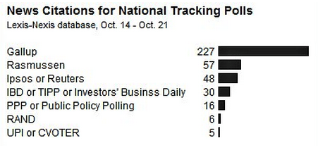
(Courtesy of Nate Silver.) Gallup is the huge outlier among the tracking polls, which shows Romney leading by 6–7 points. (On average, the national polls show an exactly tied race.)

This news is a few days old, but the general principle it illustrates is timeless. Reporting tends toward the dramatic and the surprising. In some cases, that’s probably fine—like if you read the paper for entertainment. When it comes to statistics that suffer from measurement error, it’s journalistic malpractice.

Good Government vs. Less Government

Or: Why the Heritage Freedom Index is a Damned Statistical Lie

This guest post was contributed by StatsGuy, a frequent commenter and occasional guest on this blog. It shows how quickly the headline interpretation of statistical measures breaks down once you start peeking under the covers.

Recently, a controversy raged in the blogosphere about whether neo-liberalism has been a bane or a boon for the world economy. The argument is rather coarse, in that it fails to distinguish between the various elements of neo-liberalism, or moderate deregulation vs. extreme deregulation. But if we take the argument at face value, one of the major claims of neoliberals is that countries in the world which are more neoliberal are more successful (because they are more neoliberal). I disagree.

My disagreement is not with the raw correlation between the Heritage Index and Per Capita GDP. A number is a number. My disagreement is with the composition of the index itself, and interpreting this correlation as causation between neo-liberalism and ‘good things.’

My primary contention below is that many of these measures used in the composite Heritage Index have nothing to do with less government, and a lot more to do with good government. It is these measures of good government that correlate to economic growth and drive the overall correlation between the “Freedom Index” and positive outcomes. Secondarily, I will argue that many of the other items in the index (like investment freedom) are not causes of growth, but rather outcomes of growth.

Continue reading “Good Government vs. Less Government”

Rewarding Teacher Performance? Resist the Temptation to “Race to Nowhere”

This guest post is contributed by Kathryn McDermott and Lisa Keller. McDermott is Associate Professor of Education and Public Policy and Keller is Assistant Professor in the Research and Evaluation Methods Program, both at the University of Massachusetts, Amherst.

On March 29, the U.S. Department of Education announced that Delaware and Tennessee were the first two states to win funding in the “Race to the Top” grant competition.  A key part of the reason why these two states won was their experience with “growth modeling” of student progress measured by standardized test scores, and their plans for incorporating the growth data into evaluation of teachers.  The Department of Education has $3.4 billion remaining in the Race to the Top fund, and other states are now scrutinizing reviewer feedback on their applications and trying to learn from Delaware’s and Tennessee’s successful applications as they strive to win funds in the next round.

One of the Department’s priorities is to link teachers’ pay to their students’ performance; indeed, states with laws that forbid using student test scores in this way lost points in the Race to the Top competition.  A few months ago, James pointed out some of the general flaws in the pay-for-performance logic; here, our goal is to raise general awareness of some statistical issues that are specific to using test scores to evaluate teachers’ performance.

Using students’ test scores to evaluate their teachers’ performance is a core component of both Delaware’s and Tennessee’s Race to the Top applications.  The logic seems unassailable: everybody knows that some teachers are more effective than others, and there should be some way of rewarding this effectiveness.  Because students take many more state-mandated tests now than they used to, it seems logical that there should be some way of using those test scores to make the kind of effectiveness judgments that currently get made informally, on less scientific grounds.

The problem is that even if you accept the assumption that standardized tests convey useful information about what students have learned (which we both do, in general), measuring the performance gains (or losses) of students in a particular classroom is far more complicated than subtracting the students’ September test scores from their June test scores and averaging out the gains.  We’re concentrating on the statistical issues here; there are other obvious challenges in test-based evaluation, such as what to do for teachers who teach grade levels where students do not take tests and/or subjects without standardized tests.

Continue reading “Rewarding Teacher Performance? Resist the Temptation to “Race to Nowhere””

Same-Sex Marriage and Time

Yesterday Maine voted to restrict marriage to opposite-sex couples. It’s a sad day for people who believe that all couples who love each other should be allowed to marry, full stop.

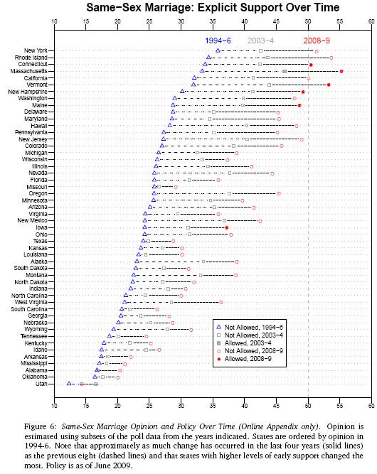
But the chart below may cushion the blow a tiny bit. It’s from a paper by Jeffrey Lax and Justin Phillips, “Gay Rights in the States: Public Opinion and Policy Responsiveness,” recently published in the American Political Science Review (via The Monkey Cage). What you are seeing is support for same-sex marriage in 1994-96, 2003-04, and 2008-09; solid dots indicate that same-sex marriage is equal, hollow dots that it is not.

marriage

Continue reading “Same-Sex Marriage and Time”

How to Waste 45 Minutes (Like I Just Did)

Start here. Then keep reading. It has nothing to do with economics, but a lot to do with statistics.

Or don’t, if you need to get something done this morning.

Update: One reader writes in:

“I beg to differ that this link has nothing to do with economics:  The same technique it uses to detect possible making-up of poll numbers was used in a recent paper to detect possible making-up of National Accounts statistics in some developing countries in a widely used economic dataset:

http://www.bepress.com/bejm/vol7/iss1/art17/.”

By James Kwak

Modeling Everything, Public Plan Edition

Ezra Klein and Paul Krugman are both highlighting Nate Silver’s analysis of campaign contributions and the public health plan option. The quick summary? Campaign contributions matter – in this case, by about nine senators. Mainly I’m impressed and encouraged that people can use publicly-available data to quickly whip together plausible models answering questions that otherwise we would all just pontificate about.

Coincidentally, I was getting my car inspected this morning and picked up an October 2008 copy of New York Magazine in the waiting room, which had an article about . . . Nate Silver. The article includes a picture of the presidential electoral map as Silver predicted on October 8, in which he called every state correctly except Missouri (which, remember, took a few weeks to figure out whom it had voted for). Most of the article is about how the empirical approach to baseball turns out to be useful in other areas, like politics and public policy.

Update: Mark Thoma points out this counterargument by Brendan Nyhan (who long ago wrote a blog with the brother of one of the best developers at my company). Nyhan says “studies have typically found minimal effects of campaign contributions on roll call votes in Congress,” and cites a Journal of Economic Perspectives paper as backup.

OK, Nyhan may be right. But he may not be.

Continue reading “Modeling Everything, Public Plan Edition”