By James Kwak
[Note: Usually I post things here first, then on Medium. This time I did the opposite.]
Jason Furman, chair of the Council of Economic Advisers, is in a celebratory mood:
Everyone talks about income inequality these days. President Obama has actually done something about it. pic.twitter.com/QfIjMxi2ms
— Jason Furman (@CEAChair) September 23, 2016
Looking at that chart, and at Furman’s triumphant tweet, you would think inequality had declined during the Obama administration.
Not so fast.
The first thing to understand is what that chart actually says. It does not say that the top 0.1 percent’s share of national income has gone down by almost one percentage point (rightmost column) since Barack Obama took office, nor does it say that the bottom 20 percent’s income share has gone up by more than half a percentage point (leftmost column).
Unless you’re the kind of person who spends a lot of time with Tax Policy Center tables, this chart requires a bit of mental reorientation. “Change in share of after-tax income” does not mean what it sounds like—change over time. It means the difference between our universe and another, parallel universe. In that alternate universe, the “changes in tax policy since 2009 and ACA coverage provisions” did not take place. Therefore, the rightmost column in the chart measures the difference between the income shares of the top 0.1 percent in these two universes—according to forecasts of 2017. (Hey, if we’re going to estimate income distribution in an alternate reality, estimating it one year in the future is child’s play.)
So what the chart really shows is that our universe is a little less unequal than that parallel universe. But for this to mean anything, we have to know how bizarro-world is defined. According to the full report by the Council of Economic Advisers (p. 26), the parallel universe is one in which the tax policies of 2008 remain in place indefinitely—that is, the Bush tax cuts were made permanent.
But remember, when President Obama took office, those tax cuts were already scheduled to expire at the end of 2010. So a large part of Furman’s “decline in inequality” would have happened anyway if the president had done absolutely nothing. In fact, Obama extended the Bush tax cuts once in 2010, and then made most of them permanent in 2013—but, to his credit, let the tax cuts for the very rich expire.
It is true that a Republican president probably would have made all of the Bush tax cuts permanent, so Obama deserves credit for not being a Republican. But essentially his accomplishment—the thing he did—was the bare minimum anyone would expect of a Democrat.
In summary, what the chart says is this: Given the current state of the economy, the tax code we have results in slightly less inequality than the tax code we had under George W. Bush, which was scheduled to go away on its own.
The same is true of this tweet by Furman:
Across many measures, reduction in inequality is clear. Ratio of average after-tax income in top 1% to bottom fifth is down by over 20%. pic.twitter.com/tMyqbmk9aw
— Jason Furman (@CEAChair) September 23, 2016
Again, when he says “ratio of average after-tax income . . . is down by over 20%,” he’s not saying what it sounds like he’s saying—that it’s 20% lower than in 2009. He means it’s 20% lower than in the alternate universe, given the current state of the economy.
That’s a good thing. But if you really want to know if “President Obama has done something about [inequality],” the bigger question is how the economy has evolved during his tenure; you can’t just take the current state as a given.
This is a much more complicated question. It’s not clear what your historical baseline should be: 2009 was obviously an unusual year. It’s less clear what your counterfactual should be: what hypothetical president do you compare Obama’s performance to?
We can look at the bottom line, however. In his accompanying Washington Post op-ed, Furman claims,
the top 1 percent’s share of income after taxes was 12 percent in 2013 (the most recent year for which data are available), well below its 2007 peak and roughly equal to its share in 1997.
Yes, this is true. But look carefully at the complete series, from theCongressional Budget Office:
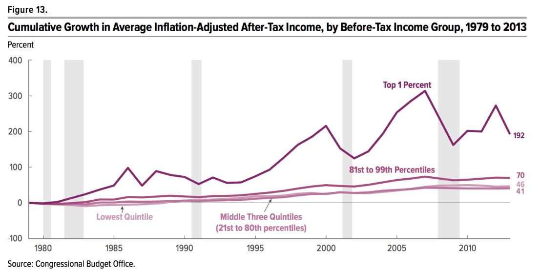
The income, and hence the income share, of the top 1% fluctuates wildly. It fell precipitously in 2008 and 2009 because the worldwide market collapse vastly reduced capital gains from sales of stock and other assets. So income inequality was relatively low when Obama took office, and started increasing as the economy recovered. Furman’s point is true about 2013; about 2012, not so much. Which year is a more accurate representation of the current trend?
On the one hand, tax rates on the rich did go up in 2013. So you might think that the drop in after-tax income was the result of higher taxes, which still apply today.
On the other hand, look at this:

That’s the top 1% pre-tax income share, from the World Wealth and Income Database. Note that it goes through 2015, while the CBO chart ended in 2013. As you can see, the 2013 drop in after-tax income (in the CBO chart) was due to a drop in pre-tax income (in the last chart)—which was then reversed in 2014 and 2015. This makes complete sense. In 2012, rich people knew that tax rates on capital gains would probably go up the next year, so they sold assets to take advantage of the low rate; having taken their gains in 2012, they sold fewer assets in 2013, so their income was down. Since then, however, as the stock and real estate markets have continued to rise, the pre-tax income of the top 1% has climbed back close to its record levels. And as their pre-tax income share has increased, we can be pretty sure their after-tax income share has increased as well.
In summary, the economic factors that produce higher pre-tax income inequality—stagnant middle-class wages, high corporate profits, and booming asset markets—are alive and well, and it doesn’t seem the Obama administration has done much about them. The administration did pass the Affordable Care Act and let the Bush tax cuts expire for the rich, both of which helped mitigate the pre-tax inequality produced by contemporary American capitalism. But even if Barack Obama called inequality the “defining challenge of our time,” he has done little to tackle its fundamental causes. Let’s hope the next president does better.

What the chart does not recognize is all the bad legislation which was passed soley due to the bush tax cuts expiring, had the idea of the cuts being extended entered the equation, all that bad legislation would never have been passed, think short term citizen memory.
The end result was a greater national public deficit, the middle class being taxed to death by the actual cost of living increases, not the formulatic ones reported by gvt, and an economy that has been completely financialized by big business as they pass the high interest credit costs to the consumer, thanks Mr. Politician, you can pat yourself on the back now and carry on in similar fashion with the new policy charts.
The outcome of globalization is not talked about much. But the current trajectory, and extending back to the 1970s, has a fairly obvious result. A small percentage of humankind will eventually own everything worth owning. This achieved of course via stock and bond ownership… with the holding of land and water rights, patents, and intellectual property, and etc, making every valuable resource owned and controlled by the few.
This outcome though is also occurring as machines and robots and etc leave the demand for labor weaker and weaker. On a global scale too, there has never been enough demand for labor to employ even half of the world’s unemployed. This as the ‘commons’ are being reduced as ‘ownership’ consolidates and as the global population expands.
My point being that the “share of after-tax income” is about Americans owning global market-share. This to insure that the USA is in a commanding position as the inevitable outcome of globalization evolves to its natural conclusion. So, blaming Obama or whoever is beside the point. One might blame ‘capitalism’…but that too falls short of grasping the full scope of the underlying problem of how to fairly and justly meet the needs of mankind without destroying the planet. We do though need to focus much more on the inevitable outcome of the current system’s inherent propensity for conflict and division.