By James Kwak
Last week, Council of Economic Advisers chair Jason Furman took to the Washington Post to announce that President Obama has “narrowed the inequality gap.” Furman’s argument, bolstered by charts and data from a recent CEA report, has won over some of the more perceptive commentators on the Internet, including Derek Thompson, who concludes that Obama “did more to combat [income inequality] than any president in at least 50 years.” In 538, the headline on Ben Casselman’s summary reads, “The Income Gap Began to Narrow Under Obama.”
But is it true?
I already wrote about the key misdirection in Furman’s argument: his measures of reduced inequality compare the current world not against the world of eight years ago, but against a parallel universe in which, essentially, the policies of George W. Bush remained in place. (This is not something either Thompson or Casselman fell for; they both realized what Furman was actually arguing.) Today I want to address the larger question of whether inequality is actually getting worse or better.
First, let’s orient ourselves. At a high level, there are two sets of forces that affect income inequality. The first set is underlying economic factors that determine inequality of pre-tax income: skills gap, globalization, bargaining power of labor, and so on. The second set is government policies that affect the distribution of income, often referred to as taxes and transfers; these policies take pre-tax income inequality as an input and produce after-tax income inequality as an output. (This isn’t a perfect distinction, since tax and transfer policies also affect the distribution of pre-tax income, but I think it’s good enough for explanatory purposes.)
Furman’s argument is that Obama has improved that second set of policies. That’s what this chart really shows; remember, it’s comparing the effect of taxes and transfers next year against the effect of taxes and transfers under George W. Bush policies.
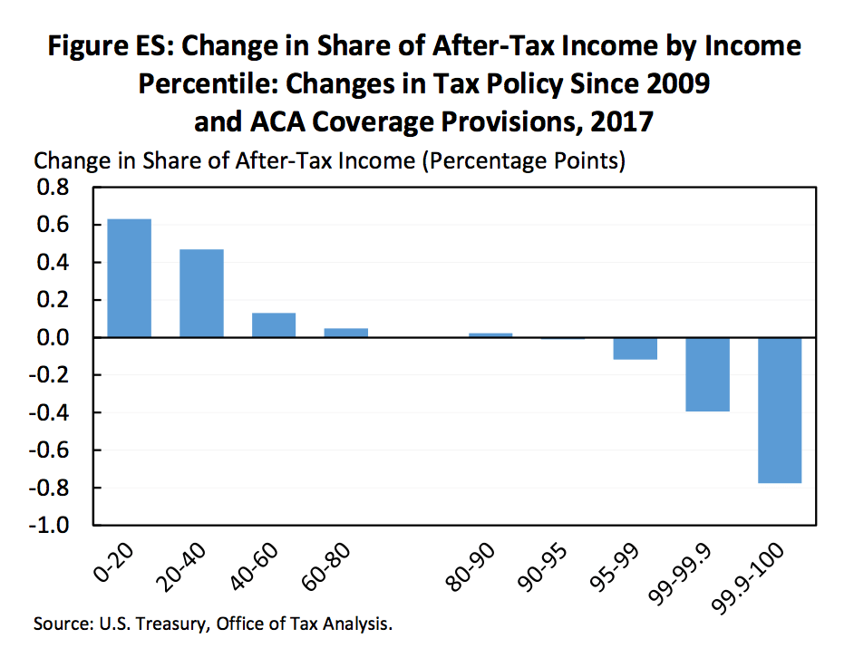
I think that’s unequivocally a good thing, although (as I pointed out before) a lot of that redistribution was simply the product of letting the top-end Bush tax cuts expire.
But what about the first set of underlying economic factors? We have all seen Piketty and Saez’s charts showing the 1% income share as a measure of pre-tax inequality. Here, however, I’m mainly going to use CBO data so that I can compare pre-tax and after-tax income shares from a single source.
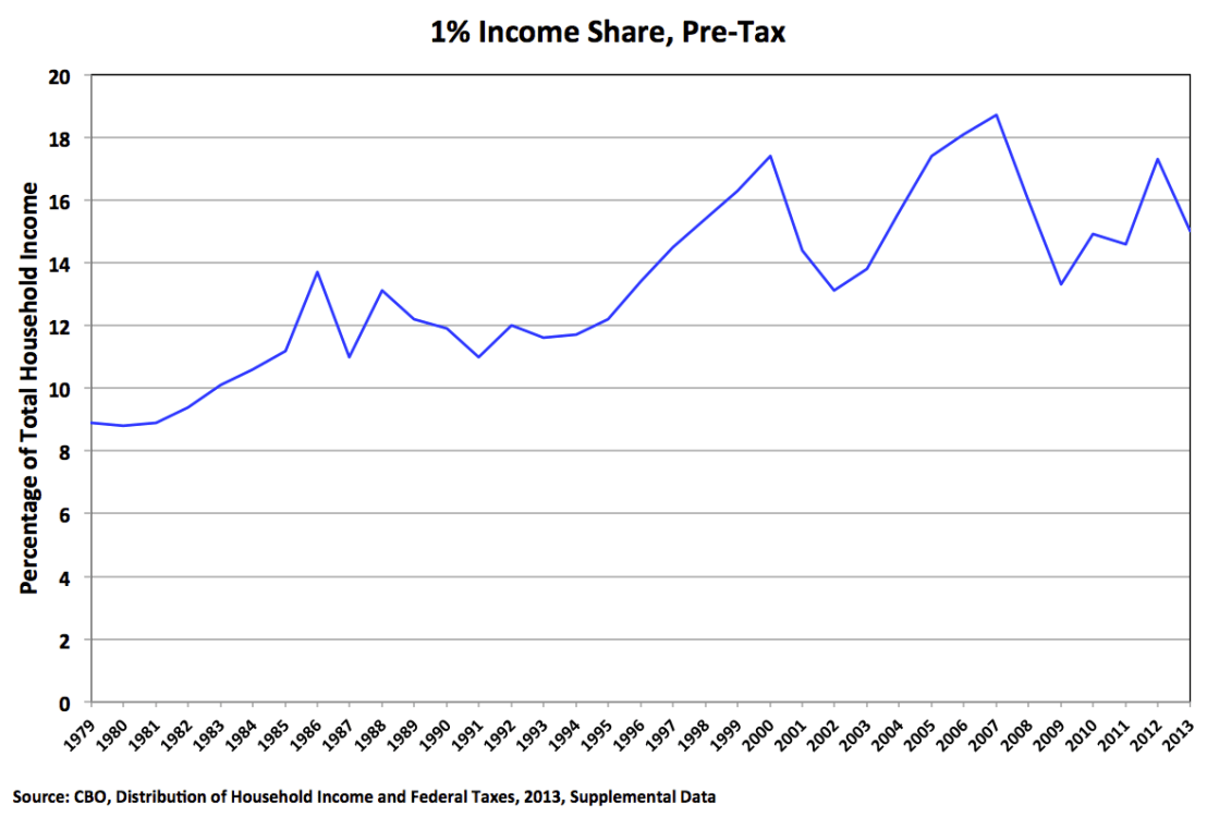
This is the 1%’s share of what the CBO calls before-tax income, which includes government transfers but does not reflect taxes. The big peaks in the second half of the chart are 2000 and 2007; the little peak near the end is 2012.
To read this chart, you have to understand that the 1% income share changes on three different timescales:
- Over the period as a whole, it’s clearly increasing, because of those underlying factors (skills gap, globalization, unions, whatever).
- But inequality also fluctuates with the business cycle. Expansion periods tend to increase income inequality, particularly if they are accompanied by increases in asset prices; a large share of the income of the very rich is profits from capital gains, which obviously rise and fall with asset prices. Subsequent recessions reduce inequality, because those asset prices fall rapidly. So the 1% income share grew from 1993 to 2000, fell with the collapse of the stock bubble, grew until 2007, fell with the financial crisis, and started growing again with the current economic expansion.
- Finally, the 1% income share also changes in response to tax policy. There is a spike in 1986 because rich people sold assets before the higher rates set by the Tax Reform Act of 1986 would take effect; that was followed by a fall in 1987, because those same rich people essentially moved their 1987 sales into 1986.
The first conclusion you should now draw is that, with the exception of 2013 (the last year of data), little appears to have changed. The 1% income share has been growing during the recovery, even as median income remained stagnant (until 2015, that is). I’ll come back to 2013 in a minute.
But, Furman would argue, and I would agree, it’s not pre-tax income that matters; it’s income after accounting for taxes. (Transfers are already included in the measure of pre-tax income shown here.) So here’s the complete chart:
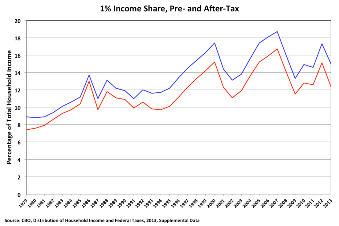
The primary conclusion you should draw, which is easy to see, is that after-tax inequality unsurprisingly moves more or less in parallel with pre-tax inequality. What’s hard to see is that the gap between the pre- and after-tax income shares of the 1% did go up significantly in 2013. From the Clinton tax increase of 1993 through 2012, the gap fluctuated between 1.8 and 2.2 percentage points; in 2013, it shot up to 2.6 percentage points. That’s because the Bush tax cuts for the very rich—including the 15% rate on capital gains and dividends—finally expired, and the 3.8% Medicare tax on investment income took effect. That is one of Obama’s major achievements on the inequality front, and he deserves credit for it.
In 2013, the fall in the pre-tax income share of the 1% and the increase in the gap between the pre- and after-tax income shares reduced their after-tax share to the comparatively low level of 12.4%, which, Furman pointed out in the Post, was “roughly equal to its share in 1997.” This is true. It’s also true that 12.4% was roughly the after-tax share in 2011, sometime between 2009 and 2010, 2003, and 2001—that’s how series that go up and down work.
The bigger question is whether that lovely dip in 2013 is the start of a trend of falling inequality, or whether it’s an aberration. Furman obviously believes the former, claiming “success to date” in the battle against inequality. In his article, Casselman says it’s too soon to say, but then concludes with this:
Even if progress has been limited, the trend line has shifted. That’s significant. The incessant increase in the income gap in recent decades often made it seem like inequality could go in only one direction: up. The recent trend suggests that’s not the case.
I think this is too optimistic. Again, the 2013 decline in the after-tax income share of the 1% was primarily due to a drop in their pre-tax income share. (The total decrease was 2.7 percentage points: 2.3 percentage points due to lower pre-tax income, and 0.4 percentage points due to changes in tax policy.) And we already know what happened to pre-tax income after 2013: it went up.
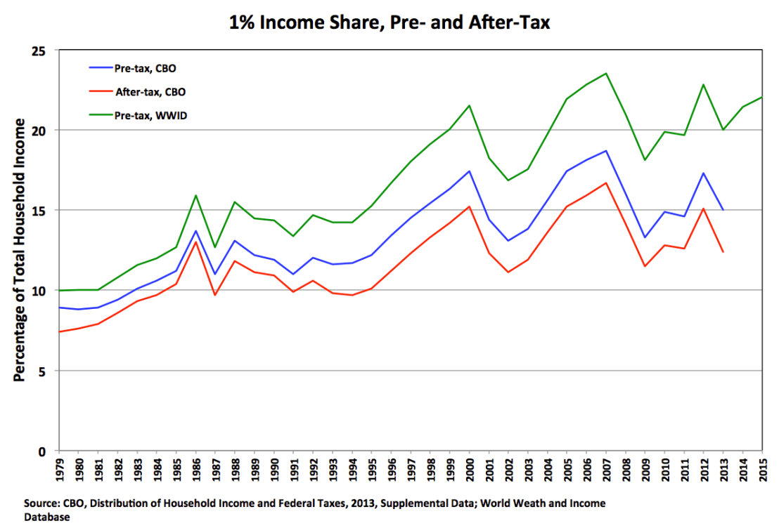
This last chart adds (green line) the top 1% income share from the World Wealth and Income Database, which has data through 2015. The green line is above the blue line, largely because it does not take transfers into account. But you can see that the two lines move together. So we can infer that in 2014 and 2015 the blue line continued climbing up and to the right.
We can also infer that the red line also climbed up and to the right. The tax changes in 2013 were a one-time event. The gap between the blue and red lines may remain larger indefinitely, which is good. But there’s no force causing that gap to increase over time. So when the CBO releases its report on household income in 2015, we’ll see that the after-tax income share of the 1% has climbed back to something like its 2005 or 2006 levels.
Most importantly, the overall pattern hasn’t changed: inequality rises during periods of economic expansion, and seems to reach a new peak during each cycle. Now that we know what happened in 2014–15, we can also explain the spike in 2012 and drop in 2013. It’s the same thing that happened in 1986 and 1987: Investors anticipating an increase in the capital gains tax rate sold their assets early to lock in a lower tax rate in 2012, and therefore took fewer gains in 2013. Smooth out 2012 and 2013 and the trend is even more clear, and conforms to the overall pattern of the past twenty-five years.
So what should we conclude from all of this? There are two questions. The less important one is how much credit the president deserves for reducing inequality. I’d say the tax “increases” of 2013 were definitely a good thing, but they largely amounted to simply not extending the Bush tax cuts. Obamacare is also a good thing. But these fall into the category of tax and transfer policy. It’s hard to point to anything he did that affected the underlying economic factors producing the increase in inequality—the general trend up and to the right you see in all of these charts. In his defense, maybe there wasn’t that much he could do. I’ll leave it at that.
The more important question is whether the trend really has shifted. I think there is little if any evidence for this hypothesis. The simplest interpretation of the last chart is that after-tax income inequality continued marching up and to the right during the current economic expansion. As Furman amply documented, changes in tax and transfer policy have widened the gap between pre-tax and after-tax inequality. But there’s no policy reason for that gap to continue widening in the future. Yes, 2015 was a good year for middle-class families, but it didn’t come close to making up for several bad years during the current expansion. There’s no obvious reason why the pre-tax income share of the 1% will stop rising anytime soon—except for the next recession, after which it will most likely continue its long-term ascent.
In summary, inequality is every bit the problem we’ve always thought it was. It’s not as bad today as it would be if John McCain had been elected eight years ago. But we’re no closer to addressing its fundamental causes.

Either way, we still have an economy which is build on a foundation of debt, that in turn leads to price increases, and the separation of the haves, and the have nots.
It’s class warfare and the rich are still winning. But, you could say that Obama fought a rather successful rearguard action, to stem the rout that was Bush’s policies, stabilize our lines and even regain a little ground. And, perhaps, the battlefield is shifting? As the majority become more aware and feel the struggle more acutely, even Republicans feel the need to issue empty platitudes against inequality.
There is a lot of savage brutality helping the suction up….we are at tribal baselines – when and for what they organized themselves – that go back to one million B.C.
Imposter, whats the point here?